Adlogic · Websites that sell
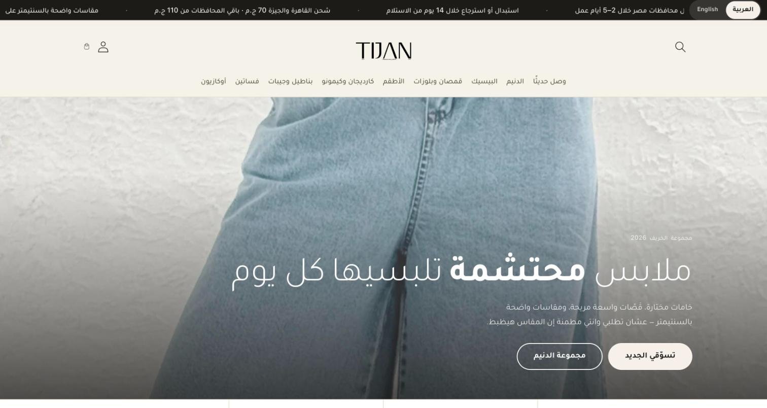
Tijan makes modest everyday wear in Egypt and sells it in outfits. The old store was a default English theme with a sale banner. The one live today is Arabic, mobile-first, and built around size confidence, cash on delivery and buying the whole look.


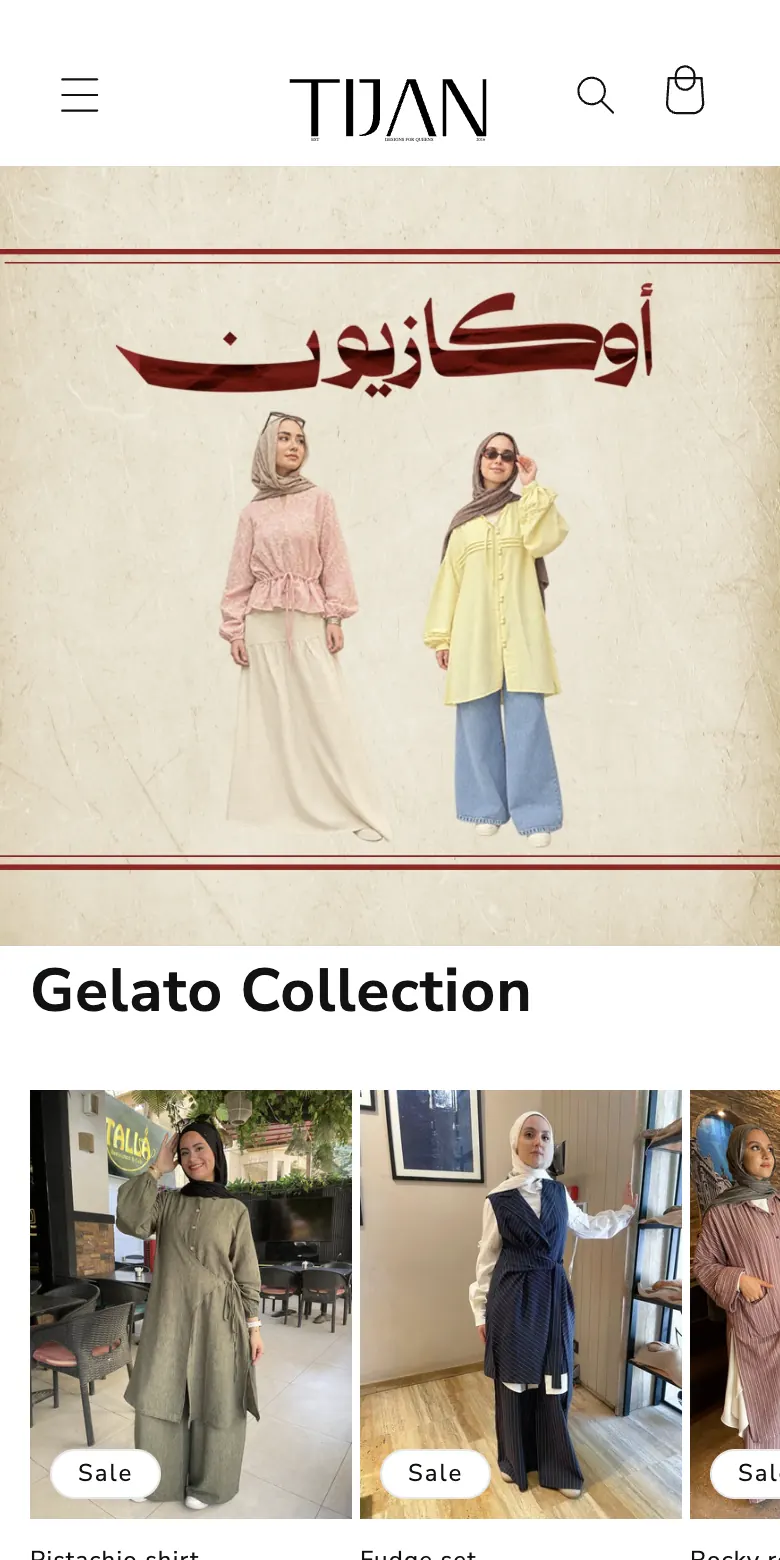
Drag across the image to compare the old home page with the one live today.
Case · Tijan
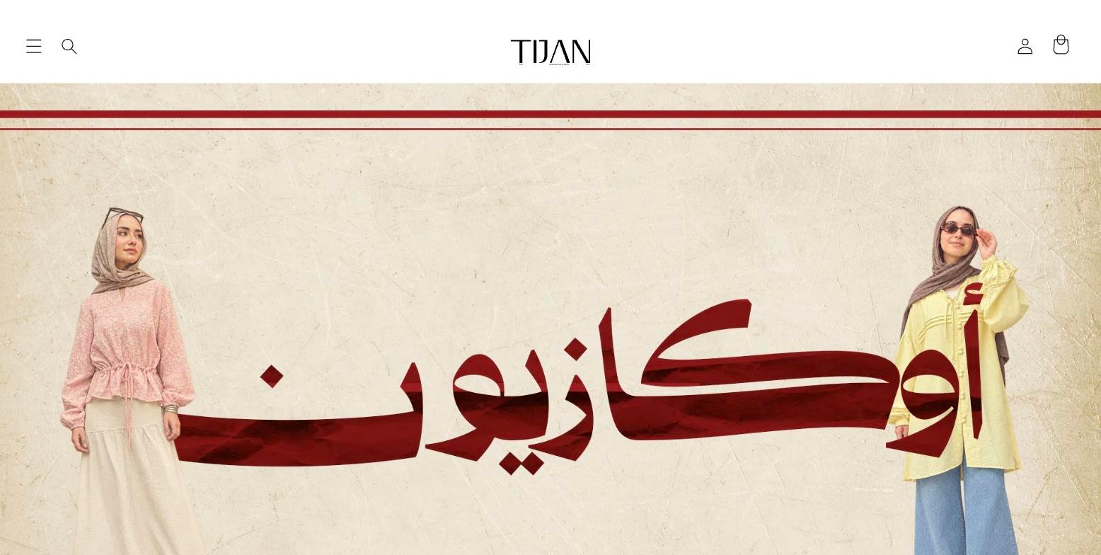
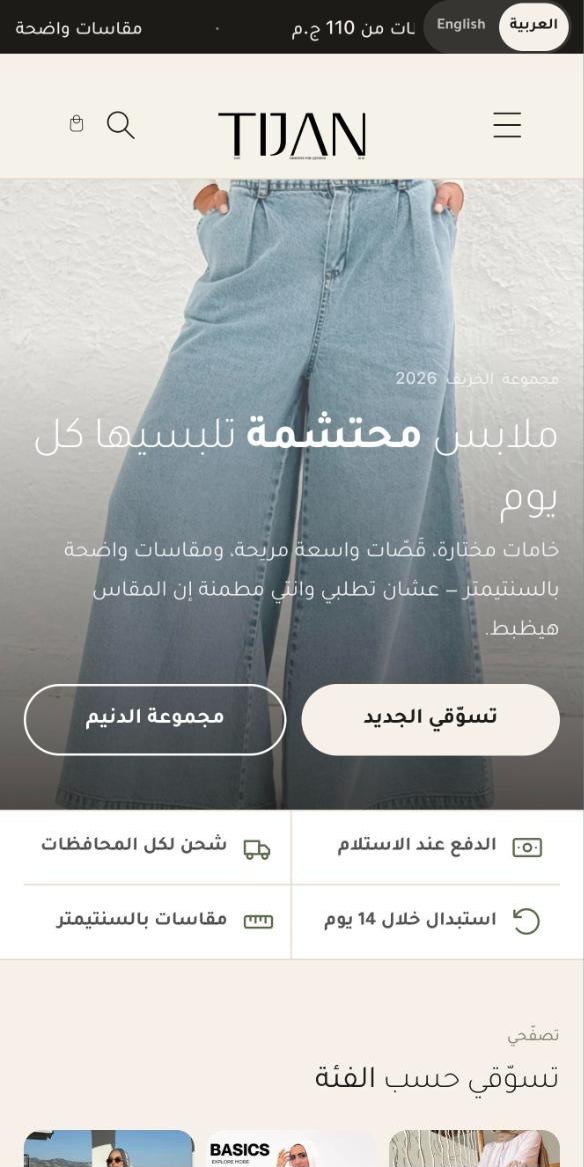
Tijan is an Egyptian modest-wear brand: shirts, wide-leg denim, sets and cardigans, bought mostly by women on their phone. The old store was a default Dawn theme in English with an “أوكازيون” banner on top: no reason to trust, no help choosing a size, and no way to buy the outfit in the photo. We have run the ads since July 2026. The new store went live in October 2026 and answers the three questions that decide an order: is it my size, can I pay on delivery, and how do I get the whole look.
What’s inside
Every screen below is captured from the live store on a phone. Nothing here is a mock-up, and all of it is built into the theme itself rather than bolted on with paid apps.

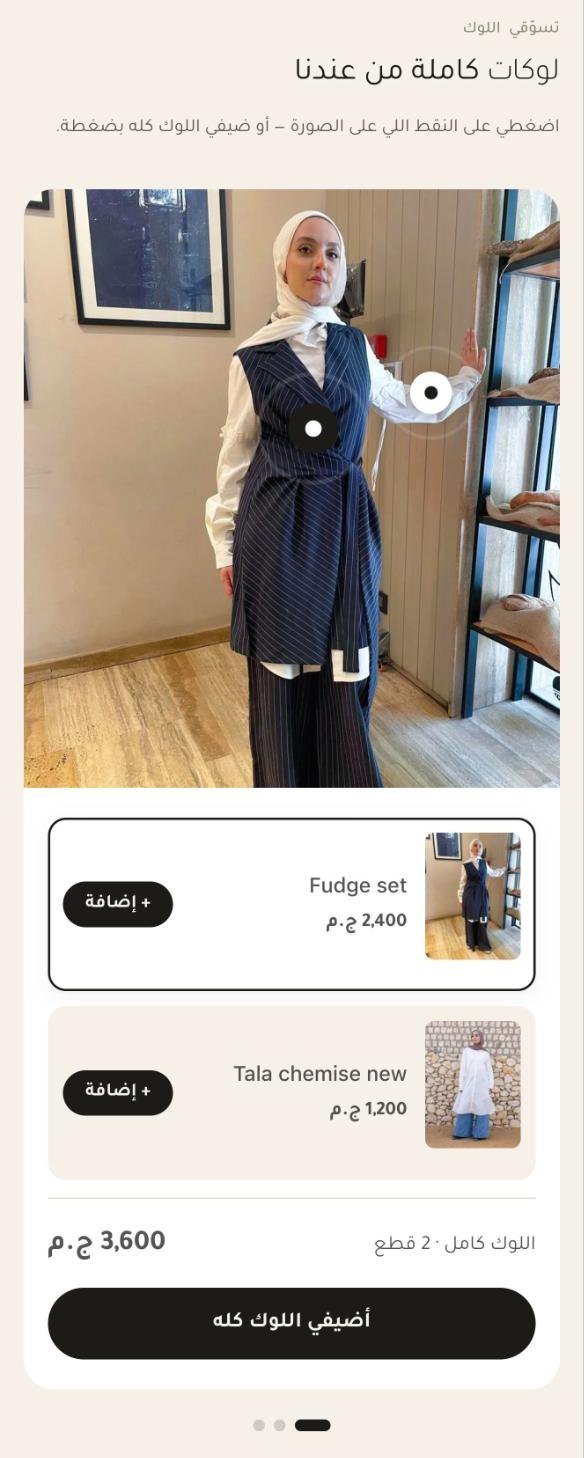
The outfit photo carries tappable dots. Under it, every piece in the look is listed with its price and its own add button, then a running total and one button that puts the whole look in the bag.


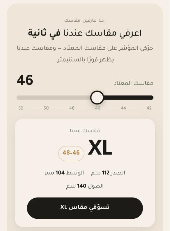
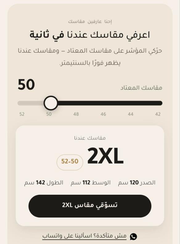
She slides to the size she normally wears. The store answers with its own size and the chest, waist and length in centimetres, and a button that opens only the pieces available in that size. Still unsure? One tap to WhatsApp.

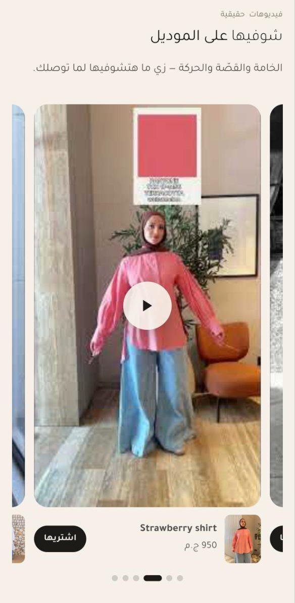
A swipeable row of the brand’s real videos. Each one carries its product, its price and a buy button directly under the video, so the piece she is watching is the piece she can buy.

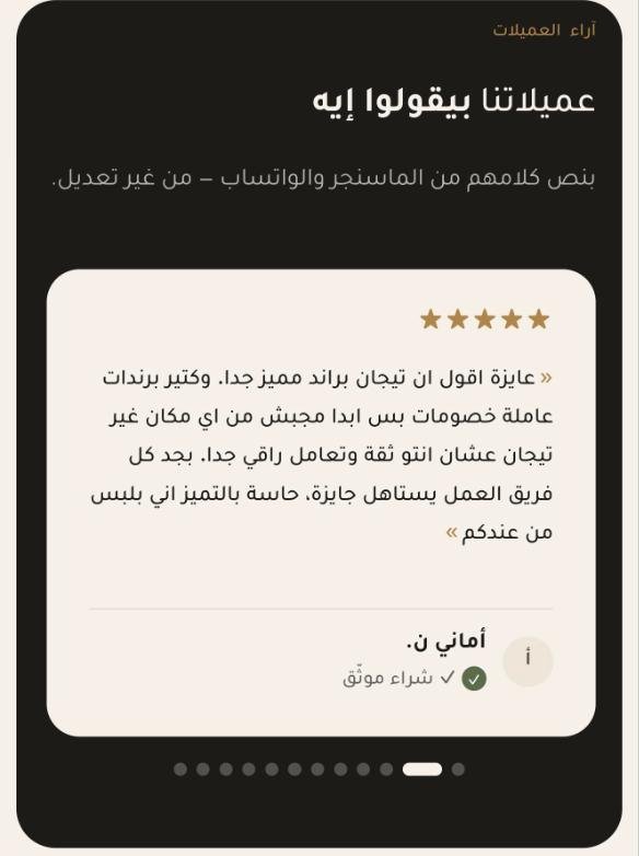
Real messages from Messenger and WhatsApp, quoted exactly as the customer wrote them, with her first name and a verified-purchase mark. No rewritten testimonials.


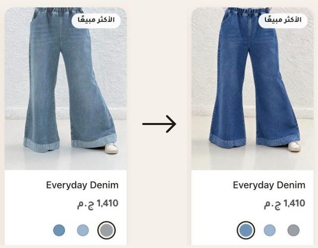
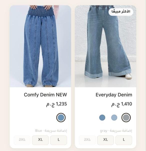
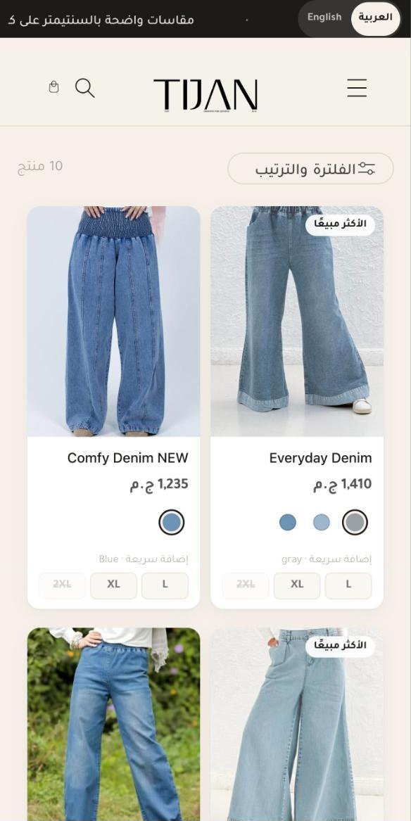
Every card in a collection shows its colours as dots: tap one and the photo changes to that colour. Sizes sit on the card too. One tap adds the piece to the bag, and sold-out sizes are crossed out before she tries them. Badges mark best sellers and last pieces.

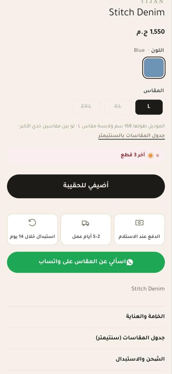
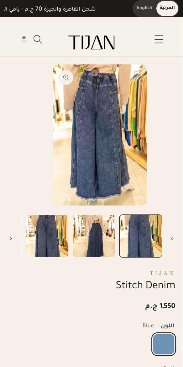
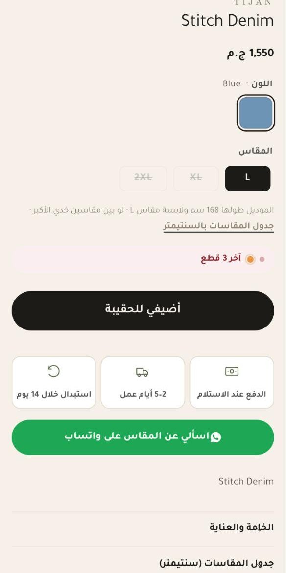
Next to the sizes: the model’s height and the size she is wearing, and a link to the centimetre table. Then a last-pieces line when stock is low, one clear button, and three boxes for cash on delivery, delivery time and 14-day exchange. Under them, a WhatsApp button for size questions.

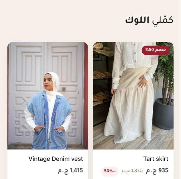
Every product page ends with “complete the look”: pieces that go with the one she is viewing, with their prices, their discounts and quick add by size.
Store numbers are in the Tijan case study, updated monthly.
What it replaced
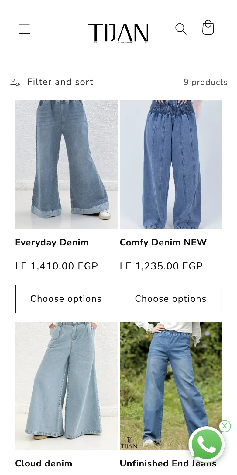
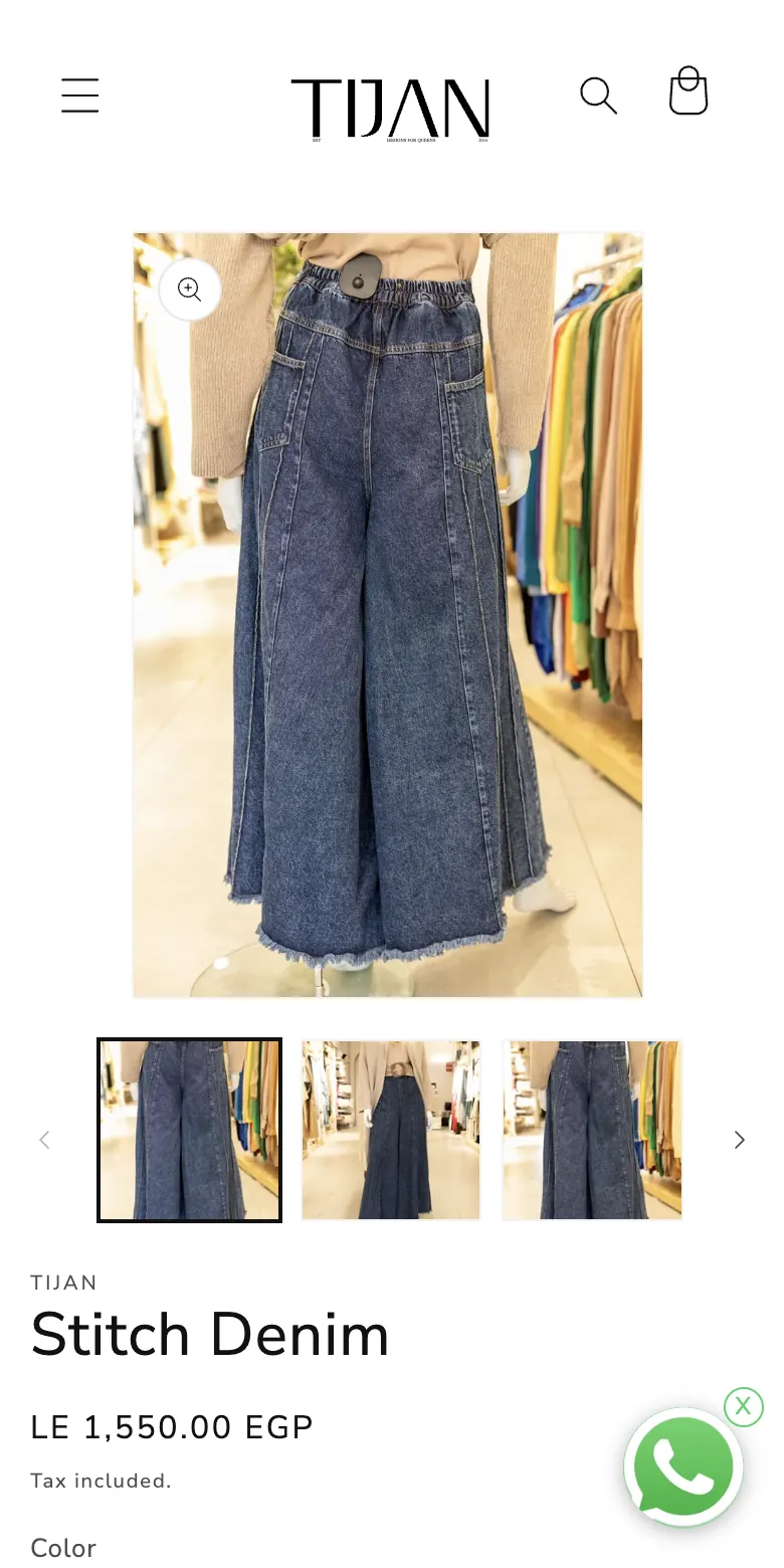
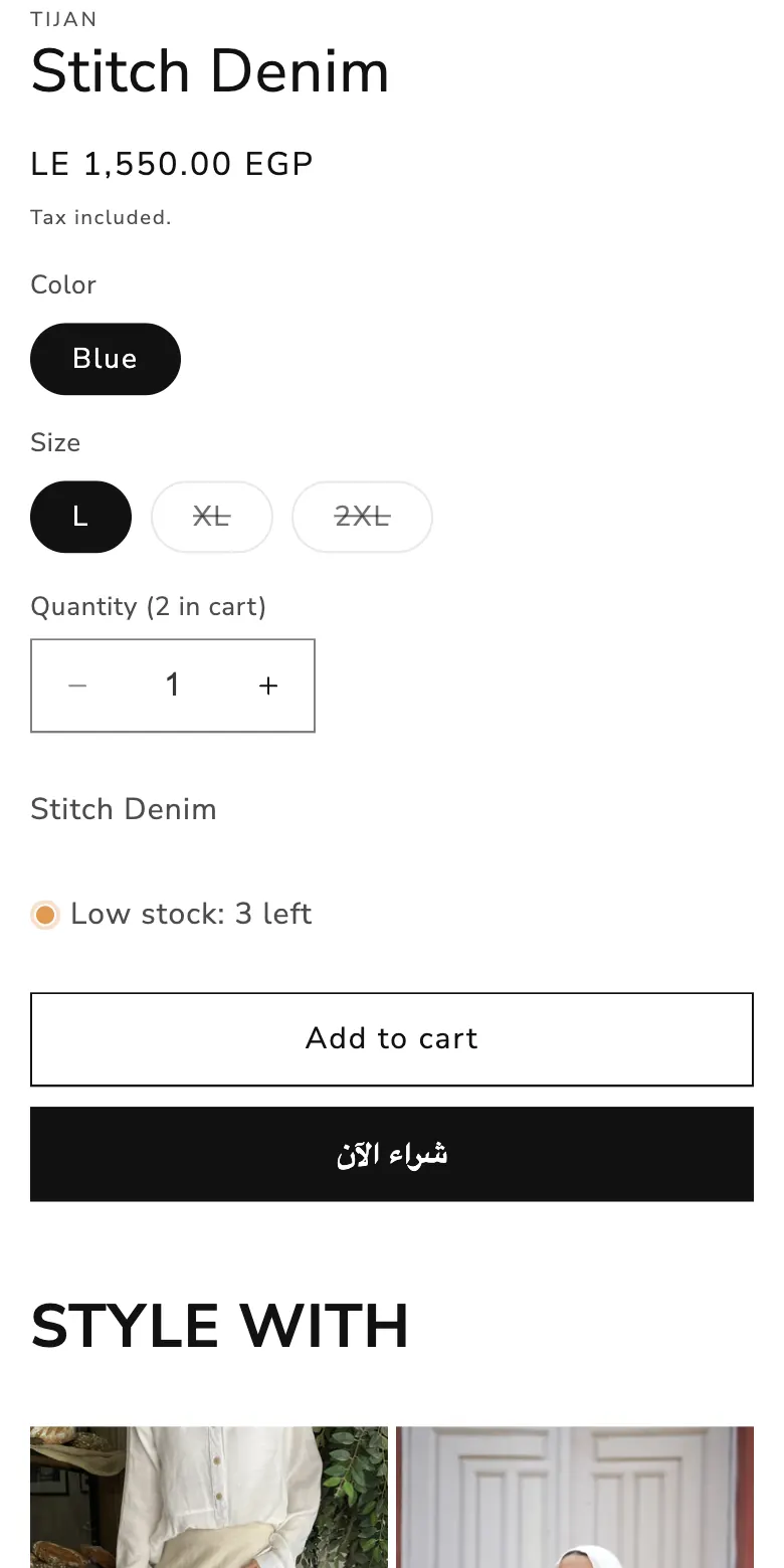
“Filter and sort”, “Choose options”, “Tax included”, “Low stock: 3 left”. Product names, buttons and labels all in English for a buyer who reads Arabic.
The old home, collection and product pages said nothing about cash on delivery, delivery time or exchange.
Three size pills, no measurements, no model reference. For modest wear the fit is the purchase decision.
Tijan shoots full looks, but a shopper could only add the piece she had opened. The rest of the outfit was a search away.
Customers were praising the brand on Messenger and WhatsApp. A new visitor saw none of it.
The old grid: photo, English name, “LE 1,410.00 EGP”, “Choose options”. No best-seller signal, no quick add, no colour or size on the card.
Before and after
Left is the old theme. Right is the store live today. Drag each screen to compare.


How we work
The service
We're a performance marketing agency, so we design for one thing: turning paid traffic into orders. That means we know which pages your ads land on and what those visitors need to see.
Questions
No. We build on your existing Shopify store and theme. Products, orders, customers and apps stay where they are.
No. We work on a copy of your theme and publish each phase only after you approve it.
No, but it helps. When we run your ads too, we design the pages your campaigns land on and measure the change from your store's own numbers.
Yes. We build a right-to-left Arabic store with copy written by a person, not machine translation, and a language switch in the header.
It depends on the scope. We release in phases, starting with the pages that turn a visit into an order, so improvements go live early.
A free review of your home page, product page and checkout on mobile, with the three changes we'd make first.