Websites built to take the order. Designed by the team that runs the ads.
We design and build the whole site: home, collection, product page and bag. Fashion, beauty, home, software and more. Each page is planned around what makes a visitor buy, and what makes the basket bigger.
Send your link. We reply on WhatsApp with what we would change first.
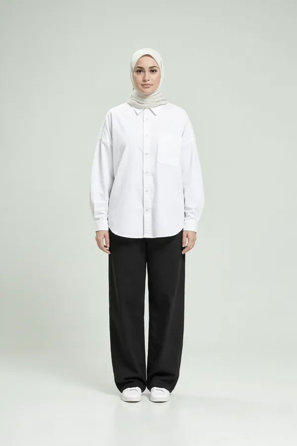
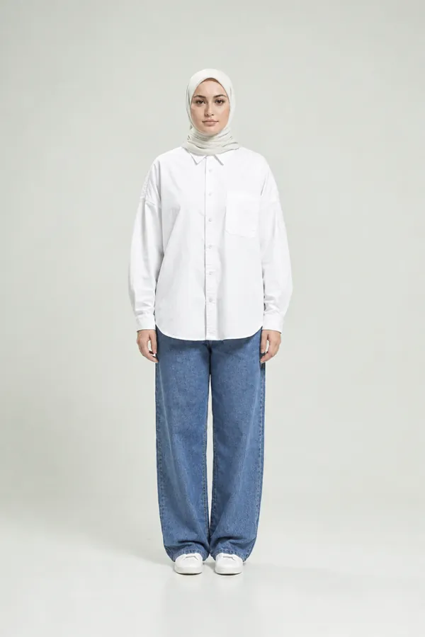
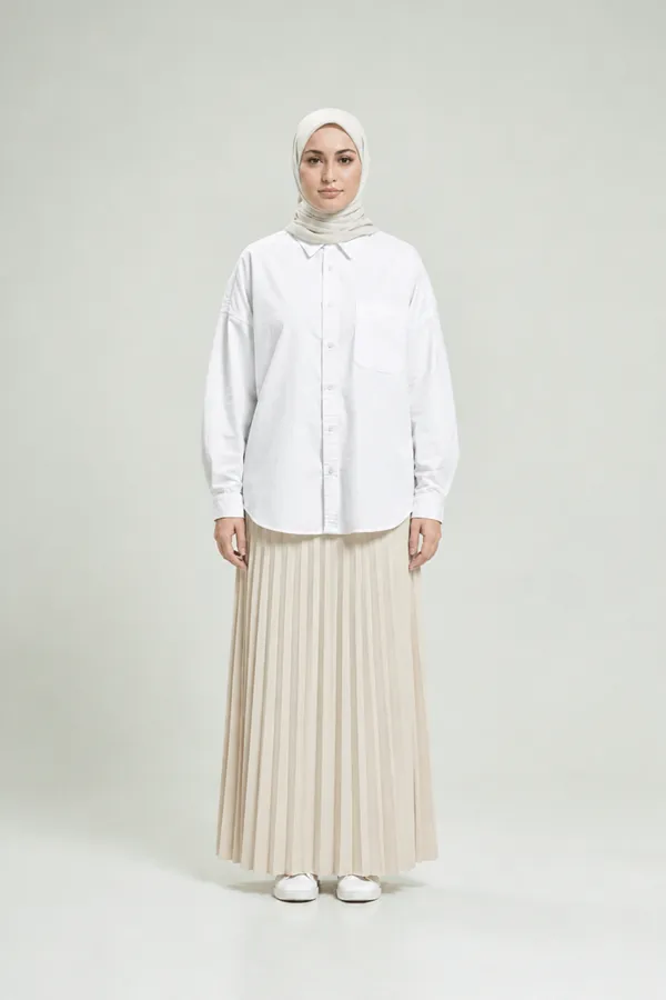
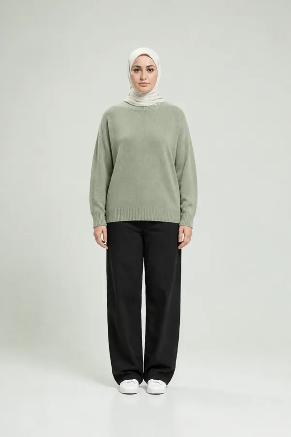
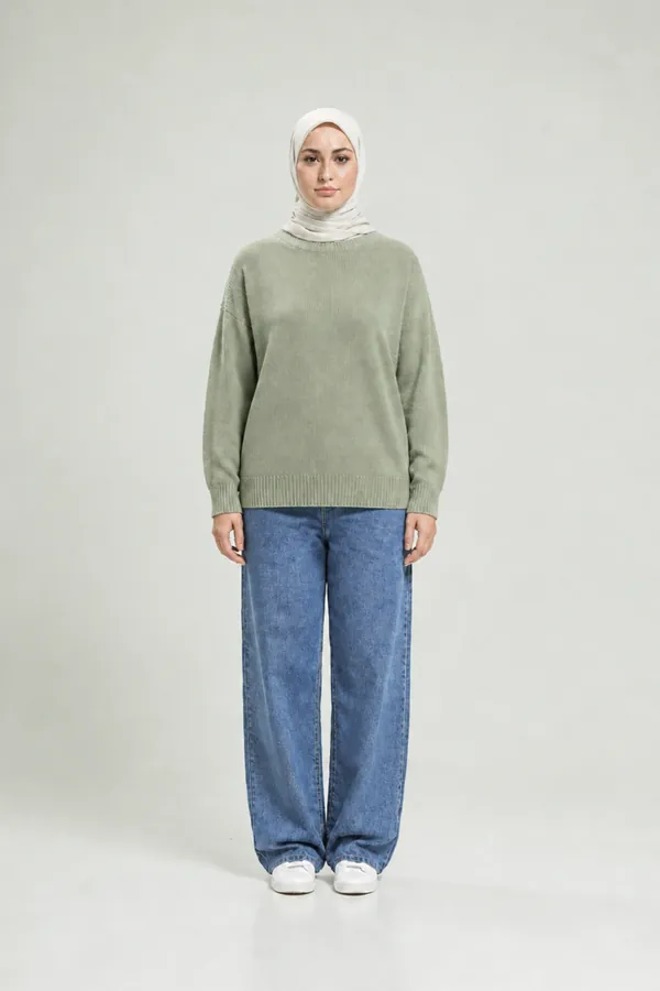
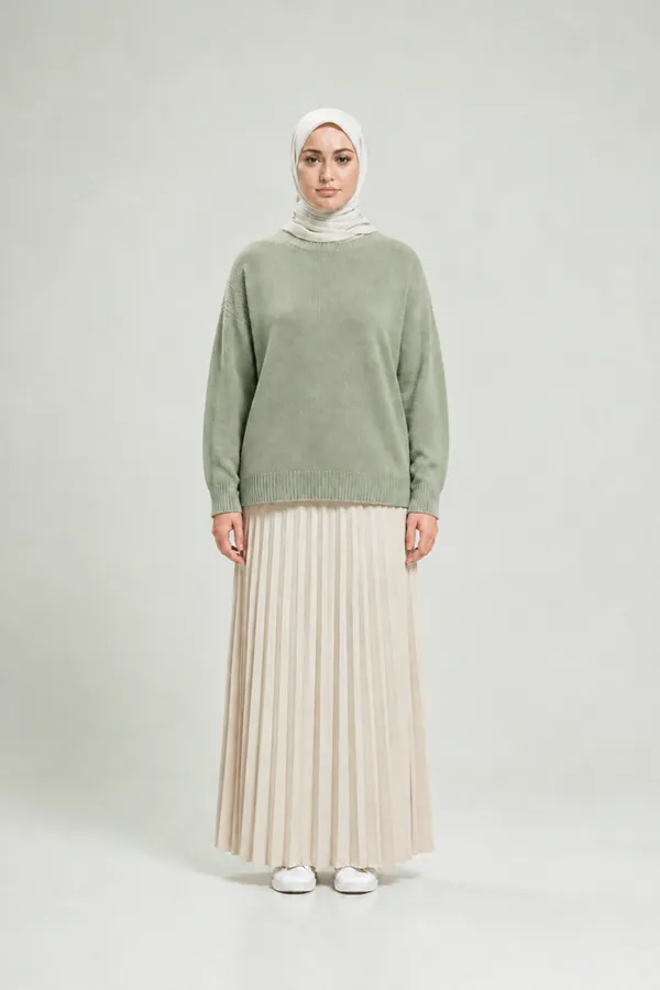
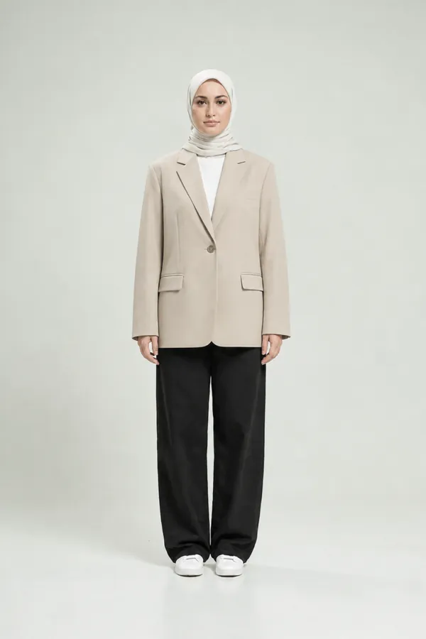
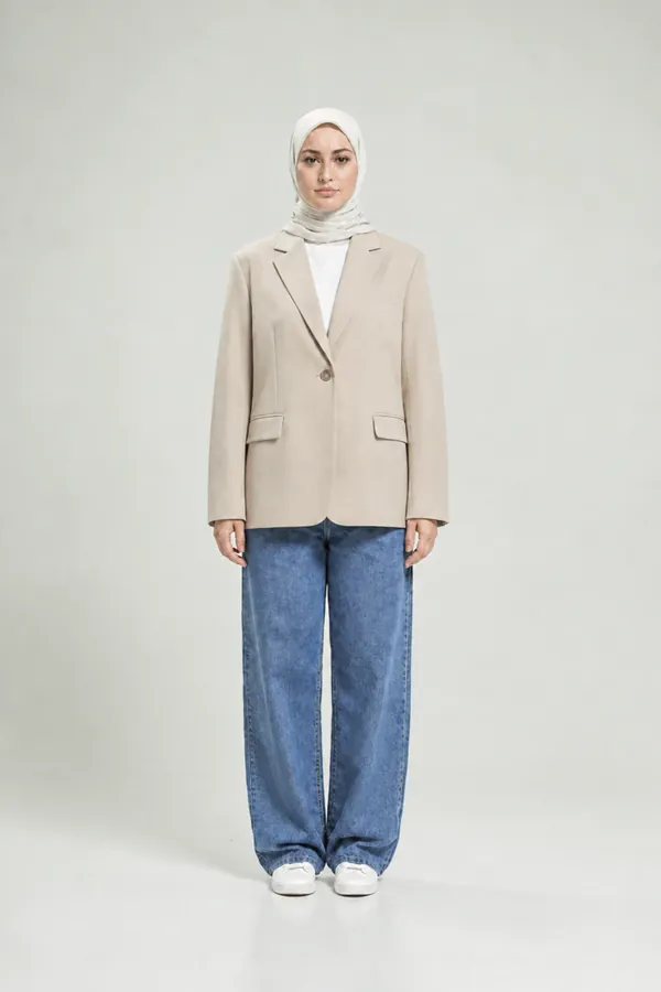
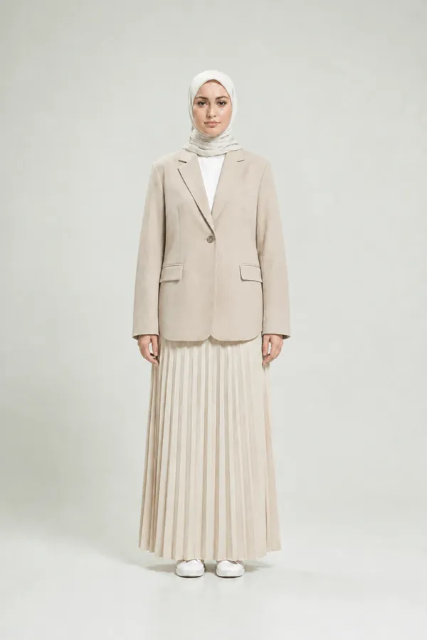
Dar Layla is a concept store we designed for this page, not a real brand. The model photos are generated; products and prices are illustrative.
Whatever you sell, the page is designed around how it is bought.
Fashion is one example. The method is the same for every kind of buying, and the page is different each time. Three more concept designs, playing by themselves.
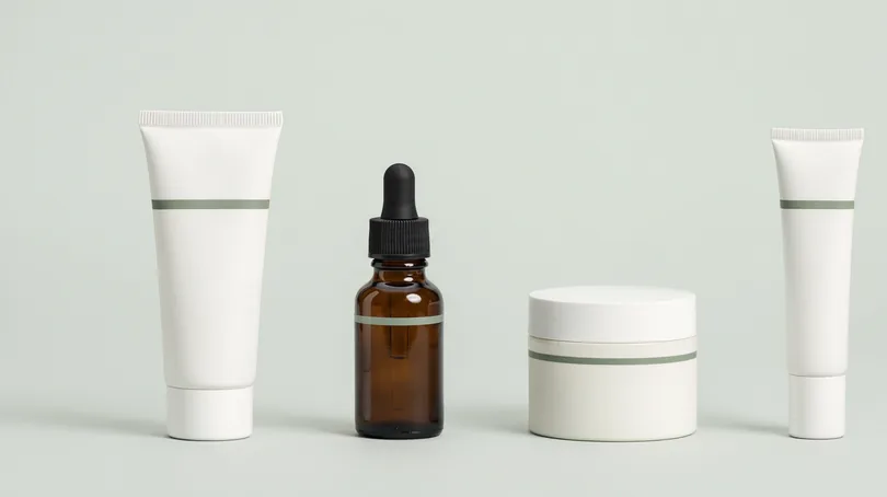
Sell the routine, not the bottle.
One product in the bag is a small order. A routine is four. The page is designed to build it step by step.
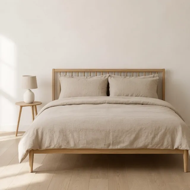
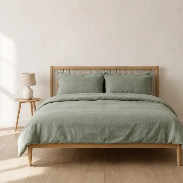
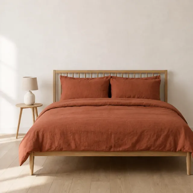
Let them see it in their own colours.
Home buyers hesitate over colour, size and how it will arrive. The page answers all three before the button.
A site that books the demo.
When there is no cart, the order is a lead. The page is designed around the moment a visitor is ready to talk.
Rimal Skin, Bayt Linen and Lumen Desk are concept designs made for this page, not real brands. Photos are generated; products and prices are illustrative.
Four pages do the selling. Each one is designed for its job.

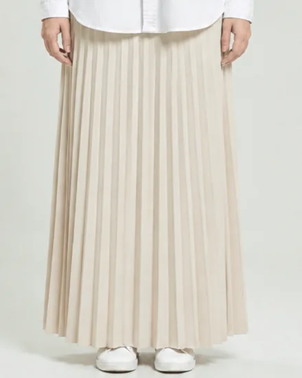
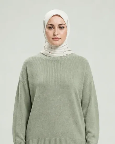
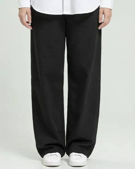

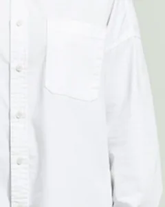
A bigger basket, designed in, not bolted on.
These are built into the pages above. Which ones fit your store depends on your prices, your margins and your platform. We choose them with you after the review.
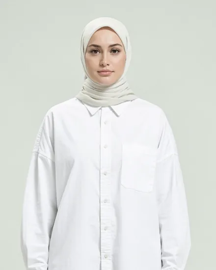
Shows how far the bag is from free delivery, and one product that closes the gap.
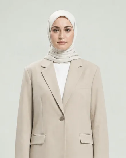 ++
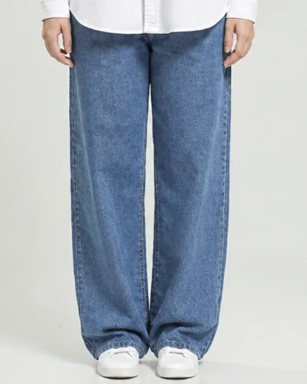
The pieces worn in the photo, added together in one tap, at a price that rewards it.
Quantity offers shown as a choice on the product page, not hidden in a code.


Small items that fit the order, offered where the decision is already made.
A paid extra that suits the gifting seasons: Eid, Mother’s Day, graduations.
An offer on the thank-you page, added to the same order without typing anything again.
Same shirt. Same price. A different page.
On the left, a page we often see in fashion stores. On the right, the page we design for the same product.
Example layouts. Brand, product and prices are illustrative.
A higher conversion rate is more orders from the same ad spend.
Put in your own numbers and see what each step is worth.
A scenario from your own numbers, not a forecast. It assumes the same visits and the same order value.
Sales results come from store and ads work together. One client’s result is not a forecast of yours. Read the case studies
A website built by the people who run the ads.
We see every day where stores lose the order after the click. That is what we design against.
Adlogic runs performance campaigns for eCommerce, apps and lead generation in Egypt, Saudi Arabia and the UAE.
Send my website link on WhatsAppBuilt on usability research, not on opinion.
Baymard Institute has spent years testing how people shop online. Six of its published findings, and what we build because of each.
of online shopping carts are abandoned, on average across 50 studies.
of US shoppers who abandoned a checkout did so because the extra costs were too high: shipping, tax and fees.
form fields are enough for a checkout. The average US checkout shows 14.88.
of leading mobile ecommerce sites have a decent or good product page experience, in the 2026 benchmark.
of mobile apparel sites do not give enough sizing information. On desktop it is 83%.
higher conversion rate is within reach of a large ecommerce site through better checkout design alone. Baymard’s estimate for large sites, not a promise for yours.
Figures are Baymard Institute’s published research, checked on 19 November 2026.
See what this means for my store